Looking Glass
Education
BRAND IDENTITY
BRIEF
Looking Glass is a financial education platform offering jargon-free content to explain the nature of money to everyday people. Their multimedia offerings contains a deep dive through financial history through to Bitcoin. The company needed a complete brand identity overhaul that spoke to the clear, concise and simple quality of their content.
SOLUTION
I developed a sleek and bright brand identity that is inspired by focus, glass, crystals and refracted light. I then created a 50-page branding style guide and several social media deliverables. The brand identity now reflects the core mission and values of transparency, clarity and optimism
Process
1. CONCEPTING
Like every branding project, this process began with a discovery workshop with the stakeholders to dig deep into the why, who, what, where and how of the brand and business.
What I took from this meeting was the visual brand needed to feel corporate, minimalistic, authoritative yet dynamic and young.
Once I had this information I then creates a 25 page concept deck. The first 13 pages iterated on core brand concepts. Then the last 12 pages presented two possible visual directions to explore.
I usually allow clients to mix and match elements from both directions as oftentimes they like elements from both directions.
2. DEVELOPMENT
Once the stakeholders and I agreed on a visual direction, I then began exploring the logo through a series of sketches. These were incrementally presented to the client so that we iterated forward together until we had something we liked.
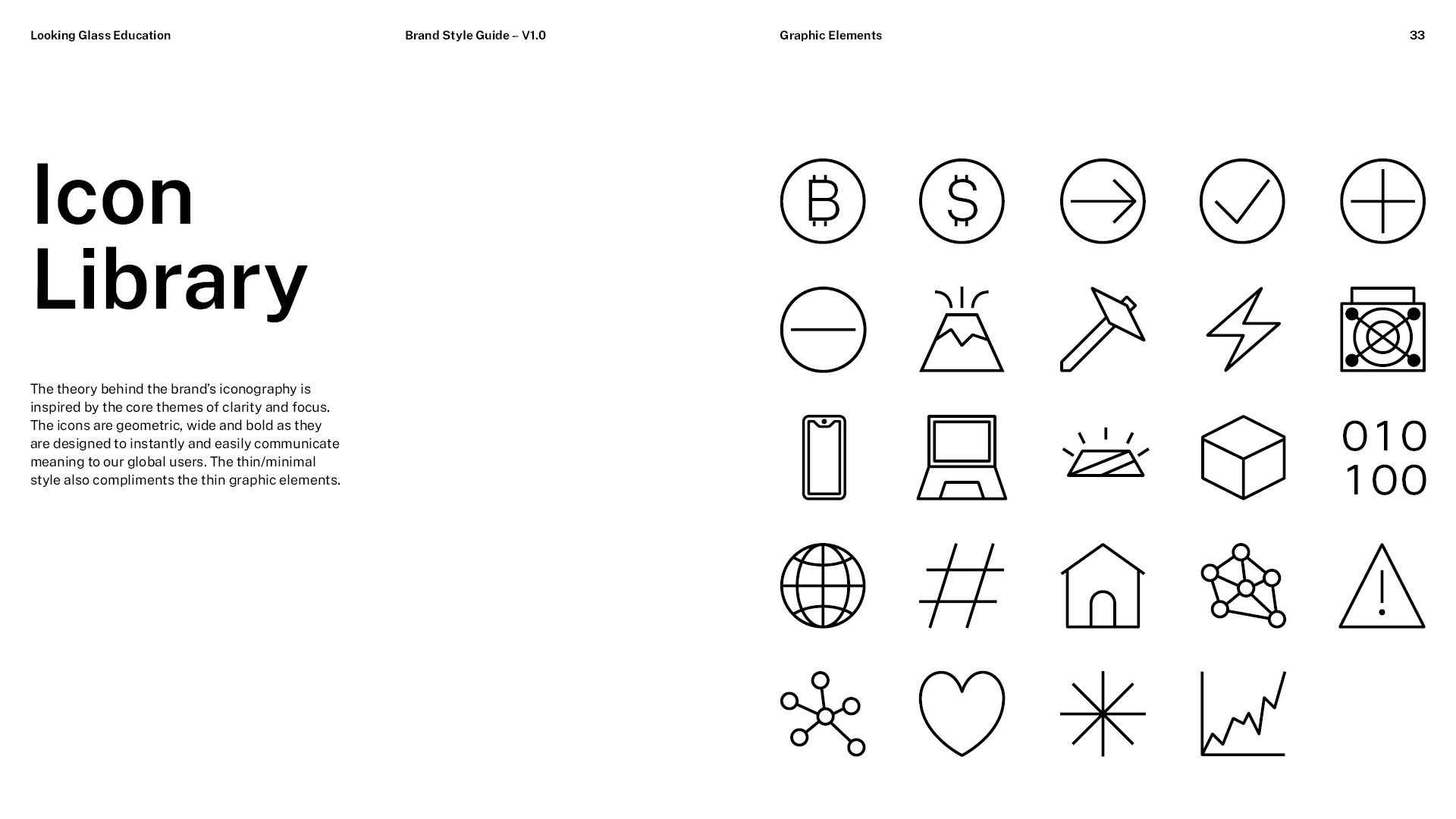
After the logo was complete I then moved onto finding fonts and designing the graphic elements and illustration. I typically like to wait until the logo is complete to do this as the logo can visually inform subsequent graphics.
TOOLS