Thank God For Bitcoin
BRAND IDENTITY
BRIEF
To create the full brand identity for a Christian platform and conference that educates its members about the economy, its history, the problems of fiat money and why Bitcoin is the modern ethical solution. The company wanted a visual solution that tied historical and traditional Christian visuals to a more modern technology-based aesthetic.
SOLUTION
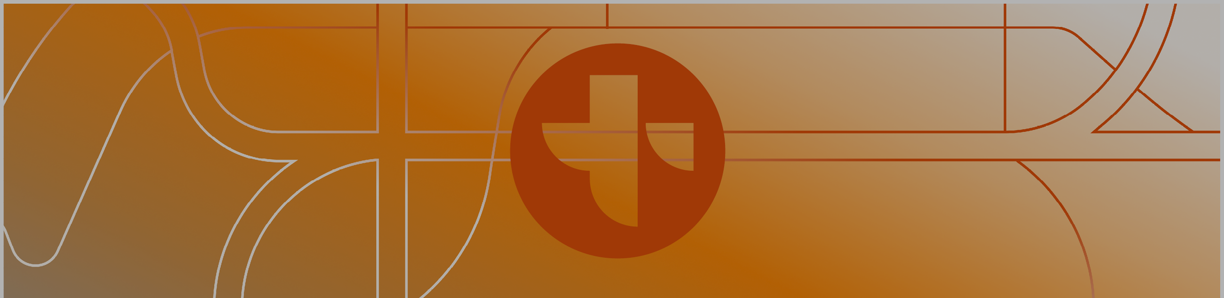
I designed a brand identity that fused the visual motifs of gothic architecture with the minimal sleek lines of surging electricity and gridded lines. The development of the brands unique illustration style was inspired by old roman biblical drawings, geometry and gothic stained glass windows. This was then applied to the website and all internal and marketing collateral.
Process
1. CONCEPTING & DEVELOPMENT
This project began with a discovery workshop to get an understanding of the vision, strategy and direction of the brand and business.
This workshop presented an interesting design challenge of needing to create a visual identity that walks the line between religious imagery and technology. Therefore, the visual identity needed to feel authoritative yet current.
The company already had a logo so the main task was to develop everything around that (typography, graphics, colours and illustration style).
I then created the concept deck where I explored and iterated on some core brand concepts, before arriving at two possible visual directions to present to their team.
TOOLS

2. DEVELOPMENT
Once I had the approval of the team on the mood boards and what elements they liked, I developed the branding around the logo. My favourite part of this was hand down the illustration style. This was because I successfully had modernised the old gothic religious illustrations and merged them with the visual effect of stained glass windows that historically feature in religious temples.
2. WEB DESIGN
Once the visual identity had been developed I was then tasked with two things:
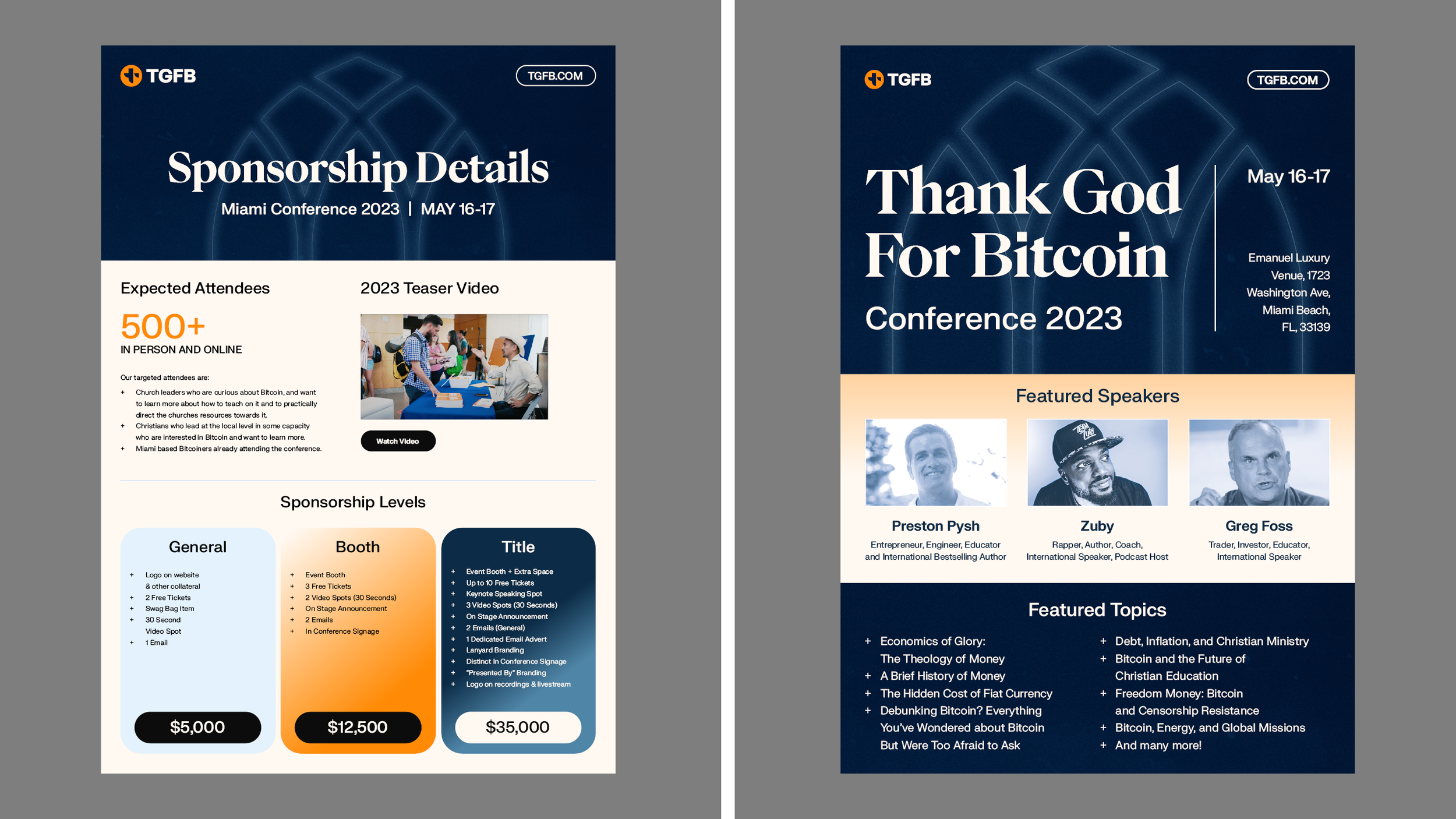
The first was to redesign their conference landing page using the visual identity. The team were adamant about using the dark (blue) mode of the colour palette for the website as this would be the palette for their conference. Therefore,I designed the site for both desktop and mobile.
The second task was to apply the branding to marketing collateral like social media templates, projection visuals and company assets such as sponsorship one pagers.